Posts

2014
 |
| Glittergasm - Blue Lucy Gallery, St Pete FL |

 |
| Ouroboros - Station Numberthree, St Pete FL |

Divina Pavalaguna - Blue Lucy Gallery, St Pete FL


Darwin Brewing, Bradenton FL

Tigresa - Bloom Gallery, St Pete FL


Octave, St Pete FL

404 - Local 662, St Pete FL


Sly Bar, St Pete FL


Bloom Gallery, St Pete FL


 |
| Octave, St Pete FL |
 |
| Bastet - Blue Lucy, St Pete FL |


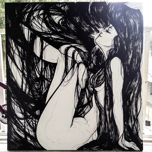
HAIR // Show Up and Throw Up Art Show - Oleson Gallery (2014)

Final shot of "Hair" for Oleson Gallery's (now moved to Bloom Art Center!) Show Up and Throw Up Art Show from back in February 2014.
The show was a blast and had also had great concept, there were no restrictions and it was open to anyone that wanted to get involved. Basically you just "Show up and Throw up" you art on the walls.
The doors opened at 1 pm, hanging supplies were provided, and within a few hours the walls were full of great art from artists from all over! It was a great way to grow the art community and invite people who had never shown in galleries before.
Here's an article about the show from Examiner.com and also found a video walkthrough!
Anyways on to the process!

The idea was a concept I've wanted to play around with for a while, I even have some recent pieces that'll be working on the same theme. I wanted the figure to be nestled snugly within the frame of the piece, kinda just lounging and relaxed, and mostly just filling the space as much as possible.
Also possibly life size, which is why the board is 4 x 4 feet. Also I was having a lot of fun rendering hair back then, and since I was only sticking to black and white it was the best spot to really play around with the design and just go at it.
But, I also wanted to play it safe so during one of the St Pete Art Meetups, which back then used to take place in side the Oleson Gallery, I started a practice piece on a 1 x 2 feet board.
Just to play with a few ideas without worrying about ruining the whole piece.


I don't remember if I actually learned anything specific from the practice piece, but it was a really good warm up to help finish the final. There's a lot less pressure on how to finish a painting when you've already done it once before.
And finally here's a shot of the lady hanging at the Oleson Gallery during the show!

I'll be updating the site little by little with in depth process write ups of all the gallery pieces I've done so far, until I catch up with all the recent work.
Until then if you want to keep up with the work real time the best bet is my Facebook page and Instagram!

Samus Aran
A quick sketch portrait of Samus Aran for #Sketch_Dailies posted originally on my twitter for their daily sketch challenges.Here's the black and white version wanted to keep it simple and strong and decided to try out a bit of a textured crosshatched background.
For the color version to keep with the background style I tried to keep the same crosshatch style to give it a comic book, pop art feel.

It was a good way to to save on time with out getting into heavy rendering. I'll probably still going in to it at a later time to give some more detail, rendering and attention to her mechanical parts.
I usually post my #sketch_dailies on my twitter when I get around to them, or even on my fb page.

Batman Beyond
This was an ink warm-up to loosen up for some other projects in the works. Plus I just started playing around in Manga Studio, so this was done mostly in there to give it a test run. Plus I love Batman Beyond and just finished reading through the whole comic run, which was very true to the show and expanded it's world, but still managed to be great in it's own right.
Anyways, there are definitely a lot of benefits in Manga Studio. Mainly the ink brushes are so smooth and precise compared to Photoshop. They're really fast and responsive, I was able to go from sketch to final in no time. I'm sure there's tweaking and brush downloads available to get a similar effect in PS, but I'm really digging Manga Studio for now.
Not saying I completely switched over either. MS is really fast for drawing, laying down lines and get it sharp and crisp. But I still finished up the fine details and shading in PS, plus the color and the background.

Here's a close up detail shot.
PS and MS both have their own strengths, the trick is gonna be figuring a good work flow to take advantage of all of them.
Follow on // Facebook // for more updates!

Hellboy
I started doing a series of my own personal comic icons, mostly characters or creators who I really admire for their style and vision. I couldn't pass up Mike Mignola's Hellboy, they both ooze style.
I started with a quick sketch. I wanted to keep the lines clean and fresh, with big shapes. I didn't want to completely ape Mignola's style, just use it as inspiration.
I knew from the start it was going to be a digital piece and sometimes starting a sketch digitally gets too messy for me. I've also been trying to streamline my process. So I just sketched it out, took a quick picture, and redrew the whole thing digitally.
Since sometimes scanning forces me to try to save the original line work, I wanted a photo so it pushes me to recreate crisp lines.

Here's the finished linework. Mostly cleanup and blocking in the empty shapes. Plus he needed his iconic BPRD patch.
I tried no to get to crazy with the detail, here's a bit of a close up shot.

And onto the color! The color was a bit of a head scratcher for me, I wanted to find a nice balance between flat colors like the comic, but just enough detail to set off the linework.

And that's about it. Trying to keep the linework and detail minimal was crucial for the color not to become overpowering in the end.
Prints Available as well!